Apollo — Brand & Growth Design
Apollo — Brand & Growth Design
Apollo — Brand & Growth Design
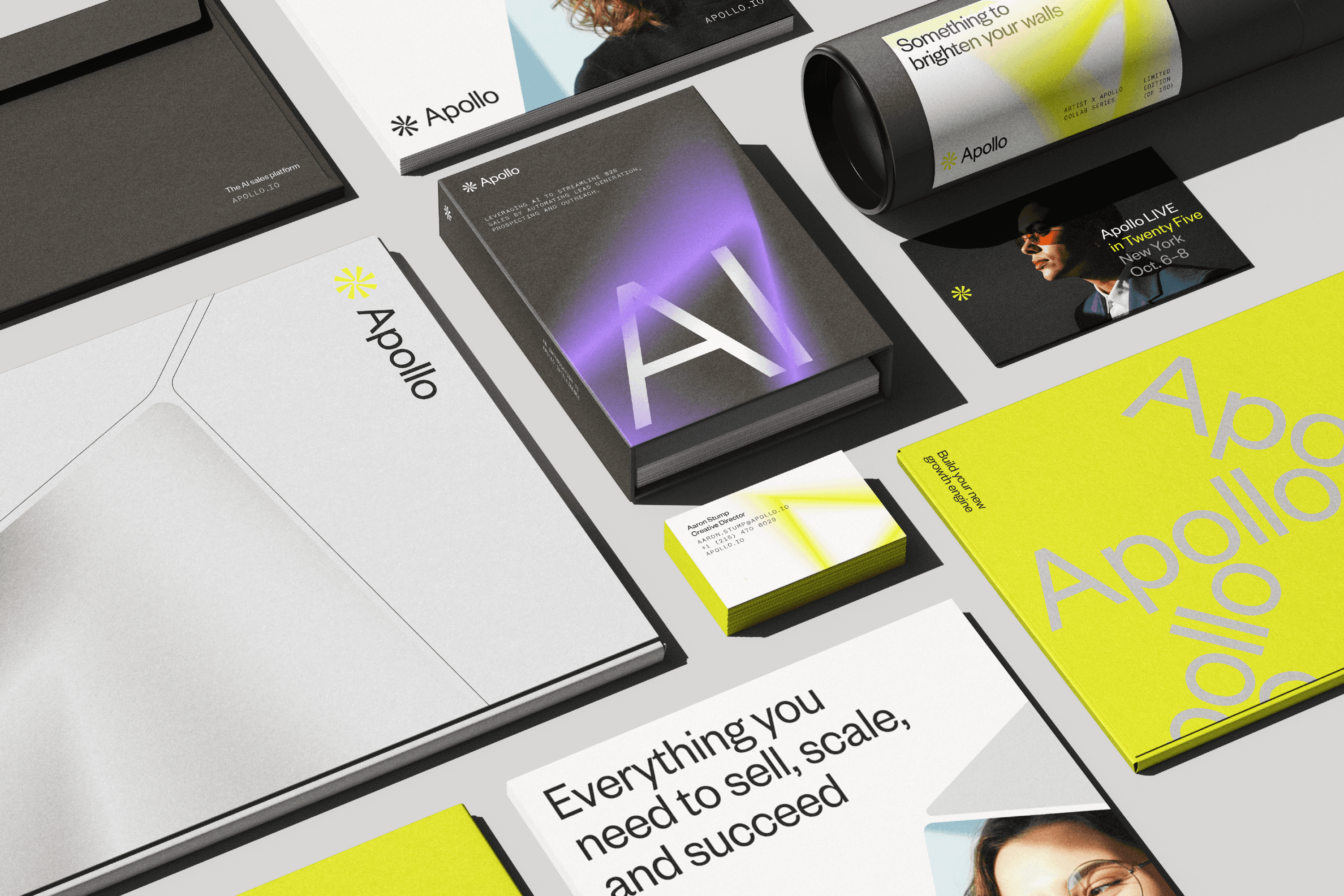
Building the brand experience behind a platform used by millions
Building the brand experience behind a platform used by millions
Building the brand experience behind a platform used by millions
Two years redesigning acquisition, onboarding, and conversion touchpoints for one of the fastest-growing B2B SaaS companies in the world.
Two years redesigning acquisition, onboarding, and conversion touchpoints for one of the fastest-growing B2B SaaS companies in the world.
Two years redesigning acquisition, onboarding, and conversion touchpoints for one of the fastest-growing B2B SaaS companies in the world.
The company
The company
The company
Apollo is an AI-powered sales platform that helps teams discover leads, streamline outreach, close deals, and keep their data organized in one place. With access to over 210 million contacts and 35 million companies, it gives businesses the infrastructure to move faster and sell more effectively.
Apollo is an AI-powered sales platform that helps teams discover leads, streamline outreach, close deals, and keep their data organized in one place. With access to over 210 million contacts and 35 million companies, it gives businesses the infrastructure to move faster and sell more effectively.
Apollo is an AI-powered sales platform that helps teams discover leads, streamline outreach, close deals, and keep their data organized in one place. With access to over 210 million contacts and 35 million companies, it gives businesses the infrastructure to move faster and sell more effectively.
My role
My role
My role
Over two years, I designed and optimized AI-powered experiences across onboarding, web, product storytelling, email, and social campaigns. Working closely with marketing, product, and engineering, I helped define hypotheses, shape experiments, and contribute to A/B testing that drove measurable increases in engagement and conversion.
I also helped scale web and email design systems to improve consistency and production speed, and partnered with engineering to build internal AI tools that reduced asset turnaround time across campaigns.
Over two years, I designed AI-powered, end to end experiences spanning onboarding, high traffic web surfaces, product storytelling, email, and paid social, crafting cohesive journeys from first impression through activation. I partnered cross functionally with marketing, product, and engineering to rapidly prototype, test, and scale new growth ideas.
I also expanded the web and email design systems to support faster experimentation and built AI driven tools that enabled marketing teams to generate high quality creative at scale.
Over two years, I designed and optimized AI-powered experiences across onboarding, web, product storytelling, email, and social campaigns. Working closely with marketing, product, and engineering, I helped define hypotheses, shape experiments, and contribute to A/B testing that drove measurable increases in engagement and conversion.
I also helped scale web and email design systems to improve consistency and production speed, and partnered with engineering to build internal AI tools that reduced asset turnaround time across campaigns.
My goal
My goal
My goal
Apollo's product had real depth. The challenge was that new users couldn't feel it fast enough. My focus was on making the value proposition clearer, more compelling, and easier to act on at every critical touchpoint, using experimentation, scalable systems, and data-informed design to keep improving over time.
Apollo's product had real depth. The challenge was that new users couldn't feel it fast enough. My focus was on making the value proposition clearer, more compelling, and easier to act on at every critical touchpoint, using experimentation, scalable systems, and data-informed design to keep improving over time.
Apollo's product had real depth. The challenge was that new users couldn't feel it fast enough. My focus was on making the value proposition clearer, more compelling, and easier to act on at every critical touchpoint, using experimentation, scalable systems, and data-informed design to keep improving over time.
Contributors
Contributors
Contributors
Aaron Stump, Creative Director
Anton Aheichanka, Lead Designer
Brendan Walker, Lifecycle Manager
Johan Vilchez, Art Director
Manuela Moncayo, Sr. Product Designer
Min Kang, Web Designer
Raouia Boularbah, AI Expert
Spencer Ferris, Sr. Software Engineer
Aaron Stump, Creative Director
Anton Aheichanka, Lead Designer
Brendan Walker, Lifecycle Manager
Johan Vilchez, Art Director
Manuela Moncayo, Sr. Product Designer
Min Kang, Web Designer
Raouia Boularbah, AI Expert
Spencer Ferris, Sr. Software Engineer
Aaron Stump, Creative Director
Anton Aheichanka, Lead Designer
Brendan Walker, Lifecycle Manager
Johan Vilchez, Art Director
Manuela Moncayo, Sr. Product Designer
Min Kang, Web Designer
Raouia Boularbah, AI Expert
Spencer Ferris, Sr. Software Engineer
My responsibilities
My responsibilities
My responsibilities
Brand Design
Brand Design
Brand Design
Growth & Conversion
Growth & Conversion
Growth & Conversion
Web Design
Web Design
Web Design
Motion Design
Motion Design
Motion Design
Funnel Optimization
Funnel Optimization
Funnel Optimization
Lifecycle & Email
Lifecycle & Email
Lifecycle & Email
Activation Design
Activation Design
Activation Design
Systems Design
Systems Design
Systems Design
Experimental Design
Experimental Design
Experimental Design
Cross-functional Collaboration
Cross-functional Collaboration
Cross-functional Collaboration
Onboarding Experience
Onboarding Experience
Onboarding Experience
Building momentum before users had a reason to leave
Building momentum before users had a reason to leave
Building momentum before users had a reason to leave
The existing onboarding flow was functional but passive. It walked users through steps without creating a sense of momentum or payoff. Our hypothesis: if we could help users experience one meaningful win in the first session, activation rates would climb.
The real challenge wasn't UX. It was brand. Apollo's visual identity was polished at the campaign level, but had never been translated into a living, motion-rich product experience. We had to design something that felt native to the product and true to the brand at the same time.
The existing onboarding flow was functional but passive. It walked users through steps without creating a sense of momentum or payoff. Our hypothesis: if we could help users experience one meaningful win in the first session, activation rates would climb.
The real challenge wasn't UX. It was brand. Apollo's visual identity was polished at the campaign level, but had never been translated into a living, motion-rich product experience. We had to design something that felt native to the product and true to the brand at the same time.
The existing onboarding flow was functional but passive. It walked users through steps without creating a sense of momentum or payoff. Our hypothesis: if we could help users experience one meaningful win in the first session, activation rates would climb.
The real challenge wasn't UX. It was brand. Apollo's visual identity was polished at the campaign level, but had never been translated into a living, motion-rich product experience. We had to design something that felt native to the product and true to the brand at the same time.

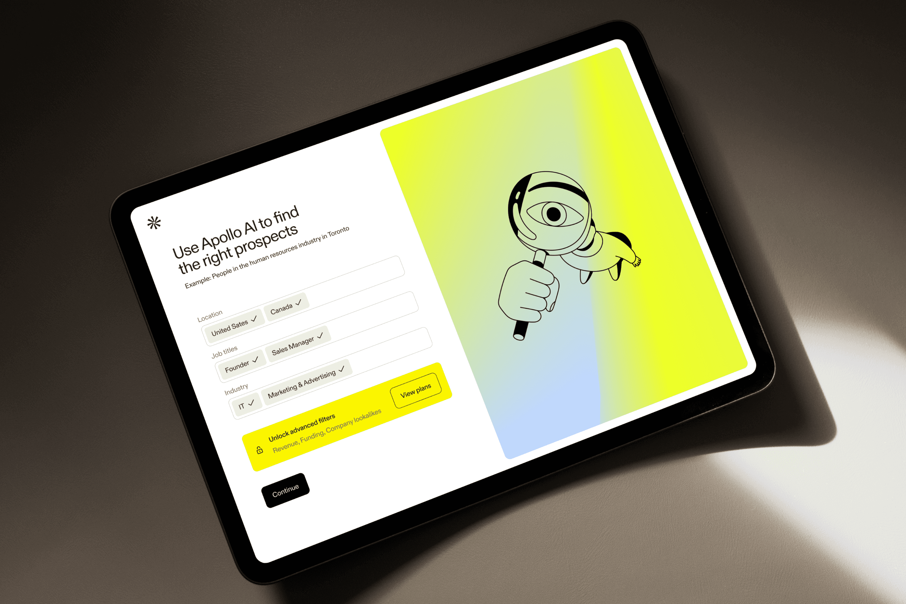
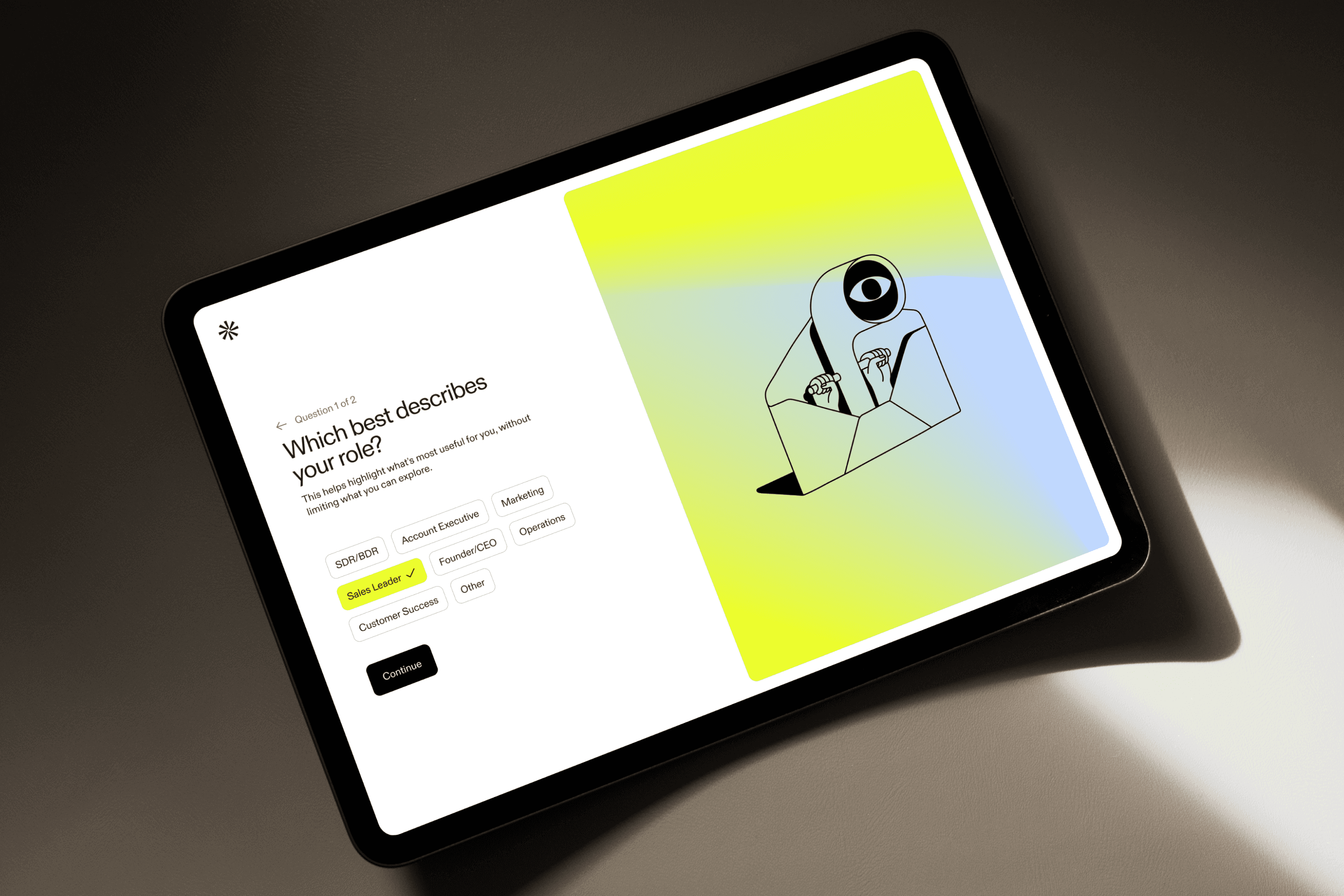
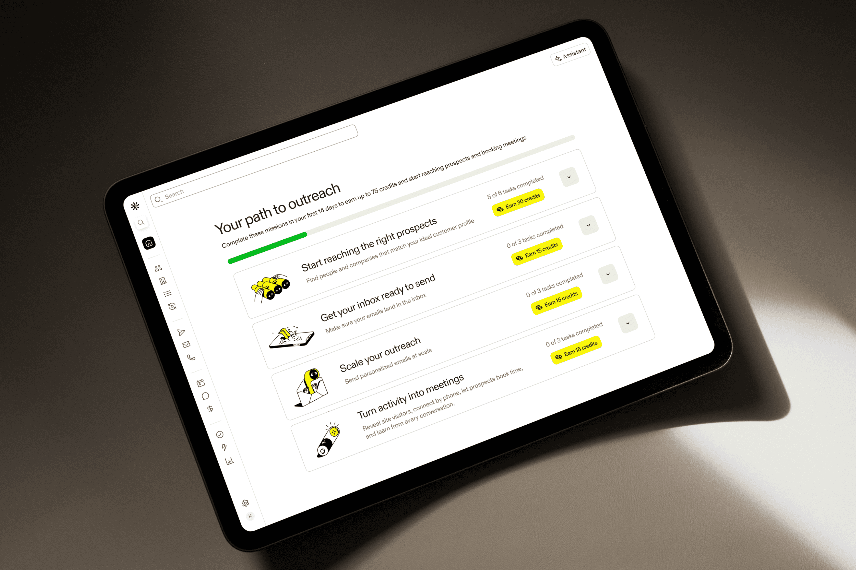
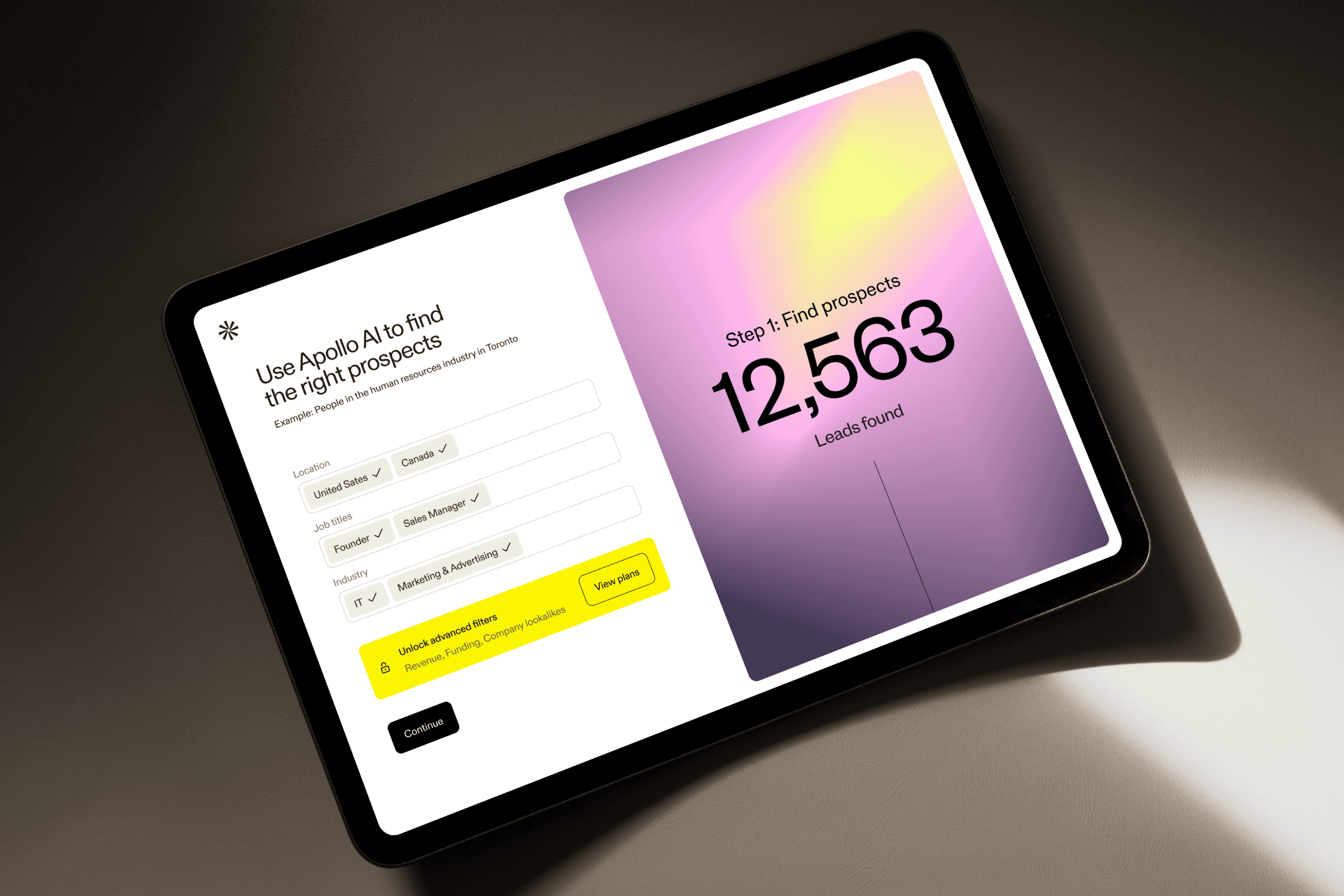
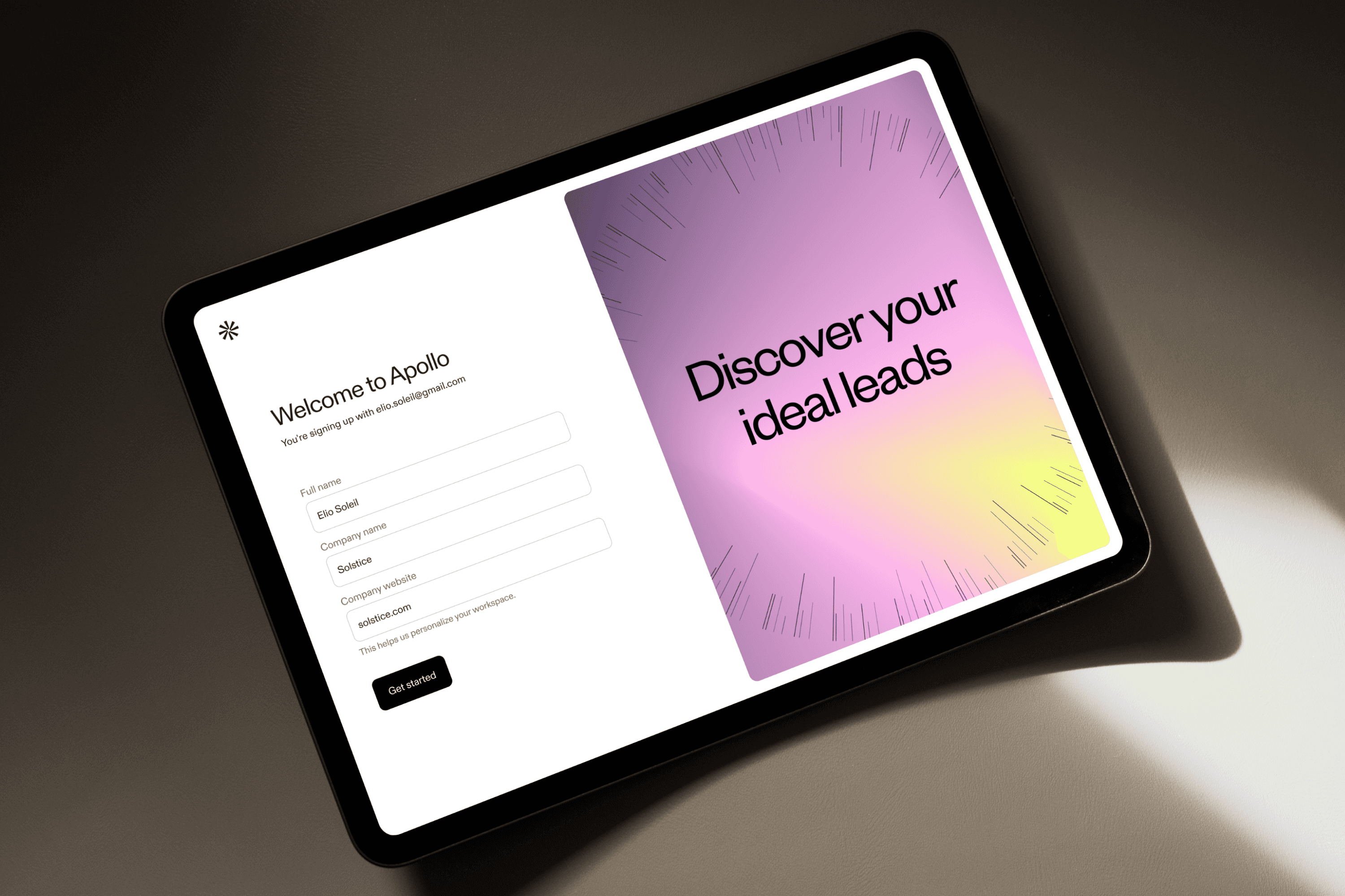
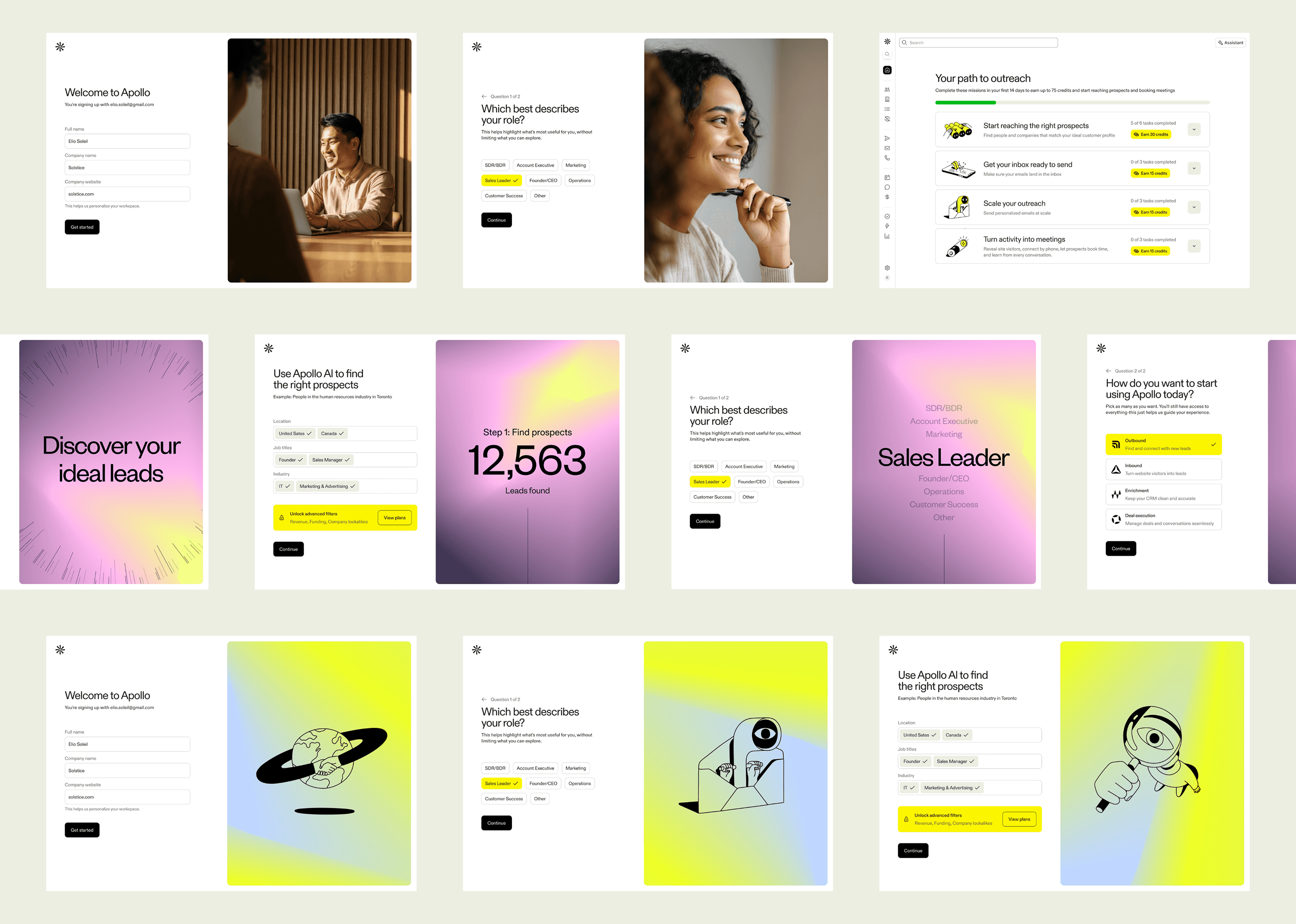
Working closely with product and engineering, I explored multiple creative directions, combining brand illustration, photography, and custom product visuals, before landing on an approach built around adaptive UI components that responded dynamically to user input. The motion and micro-interactions weren't decorative. They reflected real progress, giving users something to feel.
Implementation required tight collaboration with engineering to get the motion layer right. There were several rounds where interactions felt off, too slow or too eager, and I stayed close to that process to get them calibrated correctly.
Working closely with product and engineering, I explored multiple creative directions, combining brand illustration, photography, and custom product visuals, before landing on an approach built around adaptive UI components that responded dynamically to user input. The motion and micro-interactions weren't decorative. They reflected real progress, giving users something to feel.
Implementation required tight collaboration with engineering to get the motion layer right. There were several rounds where interactions felt off, too slow or too eager, and I stayed close to that process to get them calibrated correctly.
Working closely with product and engineering, I explored multiple creative directions, combining brand illustration, photography, and custom product visuals, before landing on an approach built around adaptive UI components that responded dynamically to user input. The motion and micro-interactions weren't decorative. They reflected real progress, giving users something to feel.
Implementation required tight collaboration with engineering to get the motion layer right. There were several rounds where interactions felt off, too slow or too eager, and I stayed close to that process to get them calibrated correctly.
↑ Activation
↑ Activation
↑ Activation
First-session completion rate improved after redesign
First-session completion rate improved after redesign
First-session completion rate improved after redesign
3 directions
3 directions
3 directions
Explored before landing on the final approach
Explored before landing on the final approach
Explored before landing on the final approach
Email & Lifecycle
Email & Lifecycle
Email & Lifecycle
Building a system, not a series of emails
Building a system, not a series of emails
Building a system, not a series of emails
Once someone left the product, they typically didn't come back on their own. The onboarding email sequence existed, but it was fragmented, designed email-by-email rather than as a coherent journey. Users would get a feature tip before they'd finished basic setup.
Once someone left the product, they typically didn't come back on their own. The onboarding email sequence existed, but it was fragmented, designed email-by-email rather than as a coherent journey. Users would get a feature tip before they'd finished basic setup.
Once someone left the product, they typically didn't come back on their own. The onboarding email sequence existed, but it was fragmented, designed email-by-email rather than as a coherent journey. Users would get a feature tip before they'd finished basic setup.
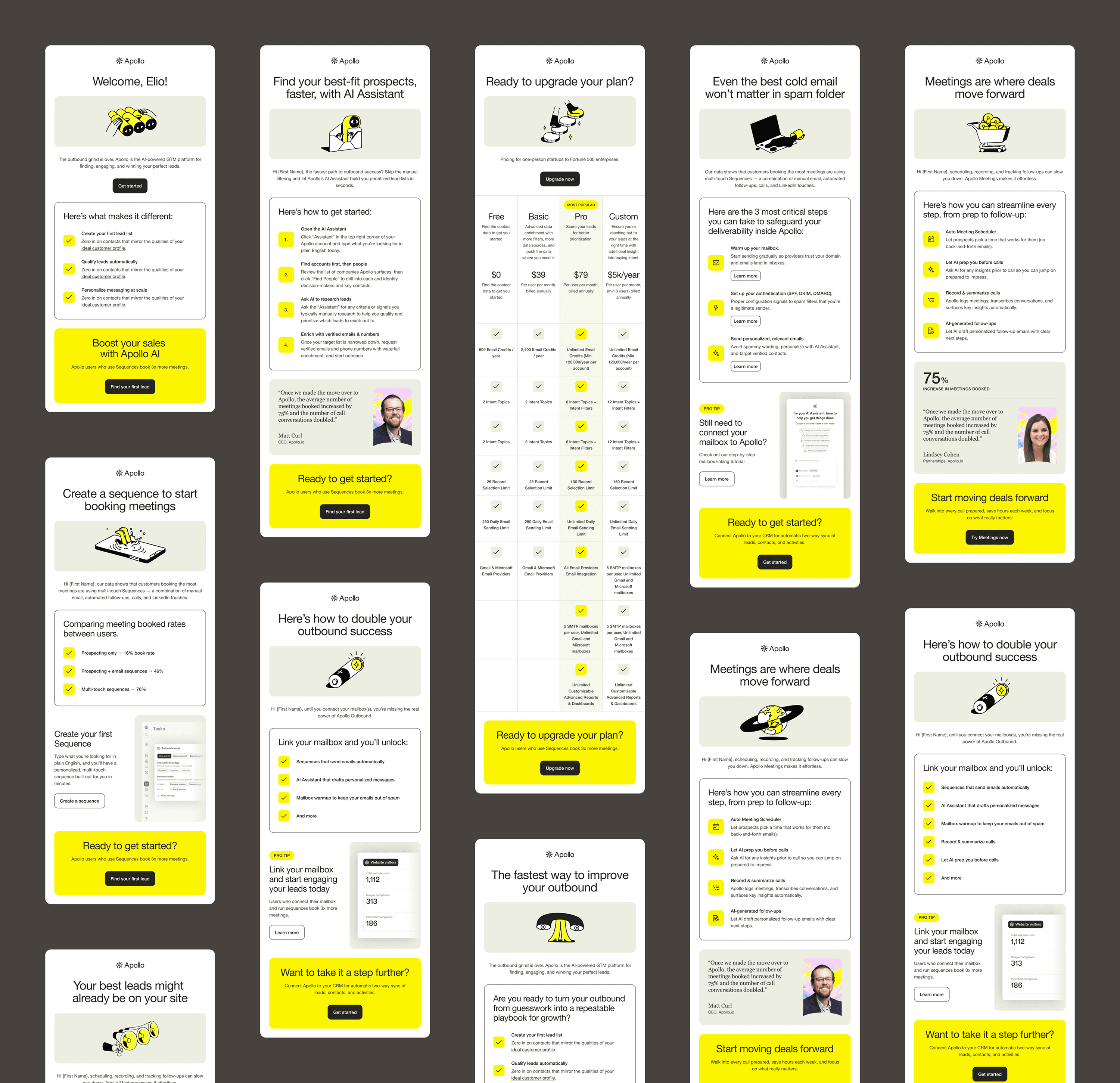
I restructured the sequence as a lifecycle system, aligned to setup milestones rather than a fixed calendar. Partnering with the lifecycle team on timing and messaging, I built a consistent visual system that was illustration-driven, mobile-first, and optimized for dark mode in Gmail. It held the series together without requiring bespoke production for each email.
To scale it, I worked with engineering to implement automated generation within our Cognition AI agent: templates, subject line variants, and messaging tests without manual rebuild cycles.
I restructured the sequence as a lifecycle system, aligned to setup milestones rather than a fixed calendar. Partnering with the lifecycle team on timing and messaging, I built a consistent visual system that was illustration-driven, mobile-first, and optimized for dark mode in Gmail. It held the series together without requiring bespoke production for each email.
To scale it, I worked with engineering to implement automated generation within our Cognition AI agent: templates, subject line variants, and messaging tests without manual rebuild cycles.
I restructured the sequence as a lifecycle system, aligned to setup milestones rather than a fixed calendar. Partnering with the lifecycle team on timing and messaging, I built a consistent visual system that was illustration-driven, mobile-first, and optimized for dark mode in Gmail. It held the series together without requiring bespoke production for each email.
To scale it, I worked with engineering to implement automated generation within our Cognition AI agent: templates, subject line variants, and messaging tests without manual rebuild cycles.
+18%
+18%
+18%
Onboarding email engagement over prior sequence
Onboarding email engagement over prior sequence
Onboarding email engagement over prior sequence
Automated
Automated
Automated
Template generation via Cognition AI agent
Template generation via Cognition AI agent
Template generation via Cognition AI agent


Conversion
Conversion
Conversion
Pricing as a product problem, not just a marketing one
Pricing as a product problem, not just a marketing one
Pricing as a product problem, not just a marketing one
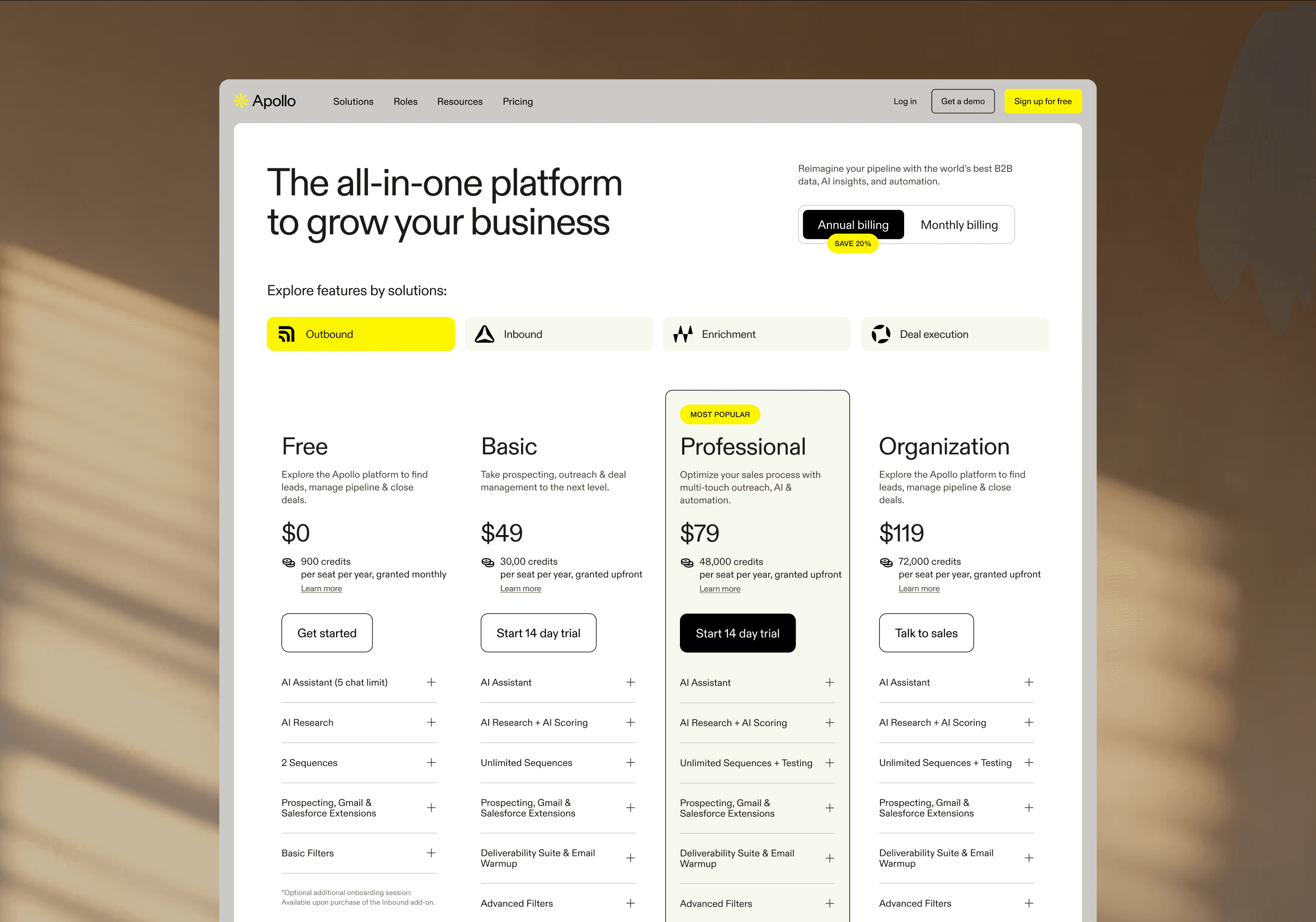
Apollo's pricing page had four product solutions and a credit system that confused most visitors. Users were leaving without converting, not because of price, but because they couldn't figure out which plan was theirs.
Apollo's pricing page had four product solutions and a credit system that confused most visitors. Users were leaving without converting, not because of price, but because they couldn't figure out which plan was theirs.
Apollo's pricing page had four product solutions and a credit system that confused most visitors. Users were leaving without converting, not because of price, but because they couldn't figure out which plan was theirs.
The temptation was to simplify by removing information. The real fix was better navigation through it.
The temptation was to simplify by removing information. The real fix was better navigation through it.
The temptation was to simplify by removing information. The real fix was better navigation through it.
In collaboration with product and marketing, we introduced a solution-based filter, a quick self-selection mechanism that surfaced the most relevant plan per user type. I also redesigned the component architecture to support real-time content variations for different audience segments, which opened up a cleaner path to experimentation.
In collaboration with product and marketing, we introduced a solution-based filter, a quick self-selection mechanism that surfaced the most relevant plan per user type. I also redesigned the component architecture to support real-time content variations for different audience segments, which opened up a cleaner path to experimentation.
In collaboration with product and marketing, we introduced a solution-based filter, a quick self-selection mechanism that surfaced the most relevant plan per user type. I also redesigned the component architecture to support real-time content variations for different audience segments, which opened up a cleaner path to experimentation.
+14%
+14%
+14%
Paid conversions following redesign and filter introduction
Paid conversions following redesign and filter introduction
Paid conversions following redesign and filter introduction
Data Landing Page
Data Landing Page
Data Landing Page
One page, a complex product, multiple audiences
One page, a complex product, multiple audiences
One page, a complex product, multiple audiences
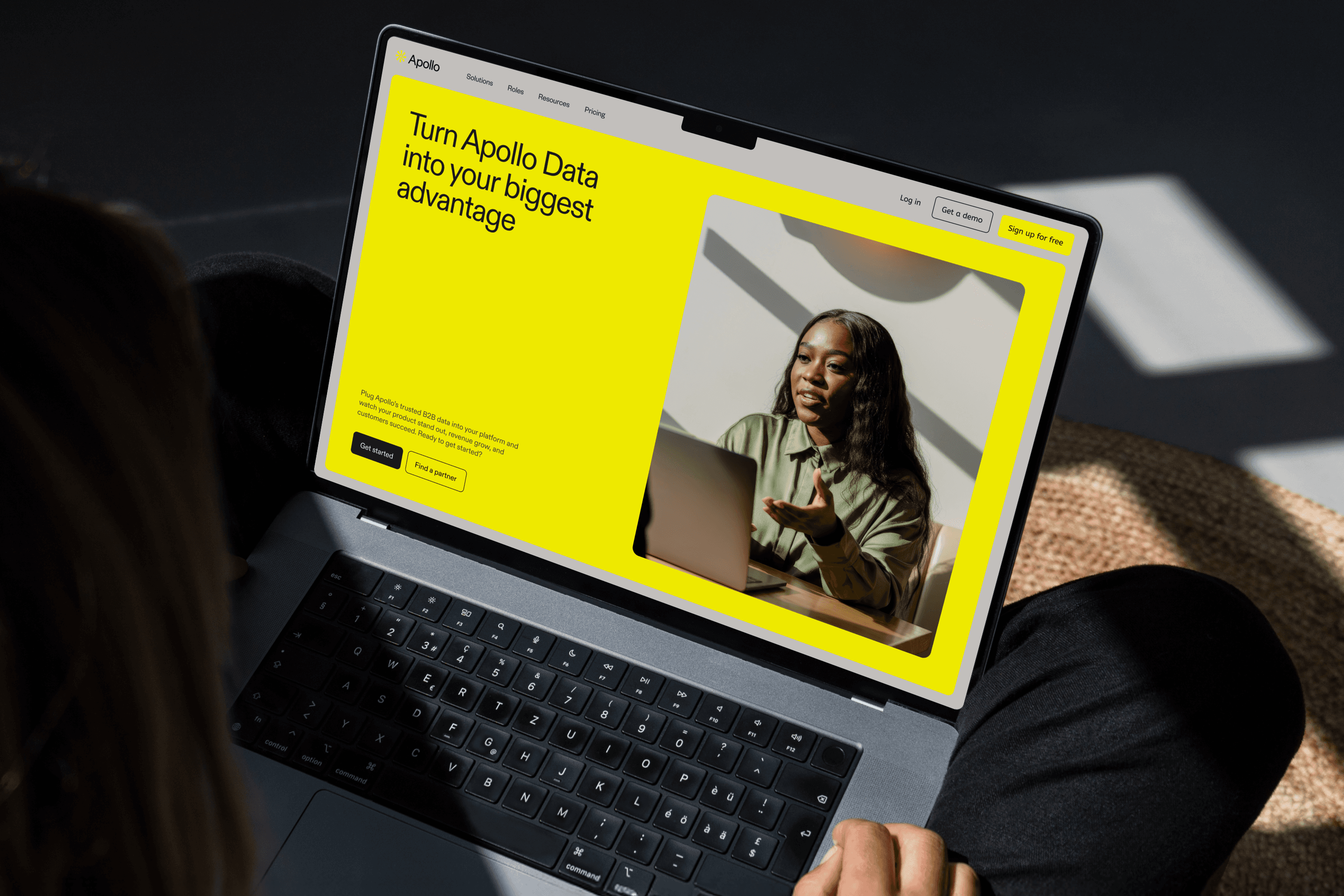
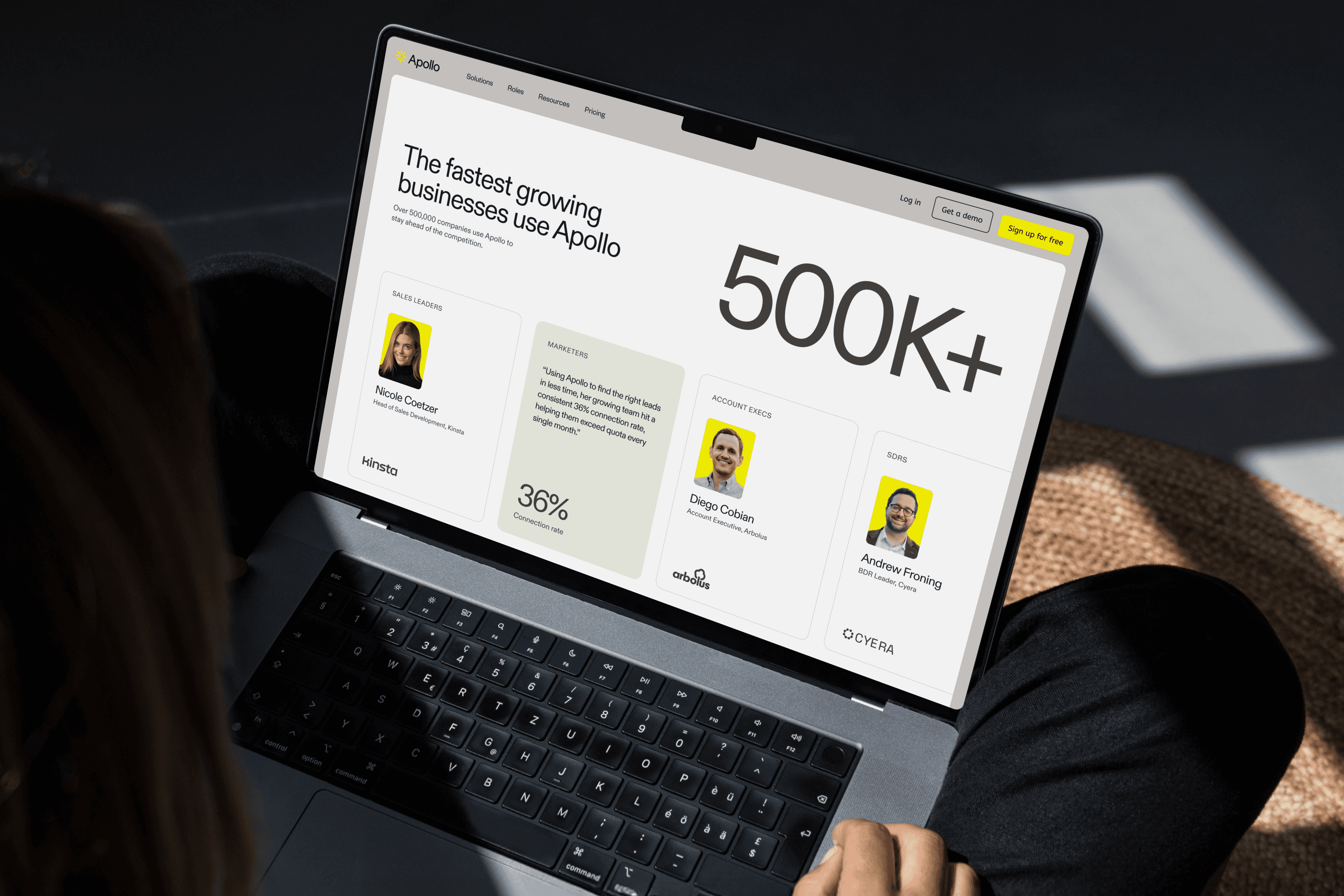
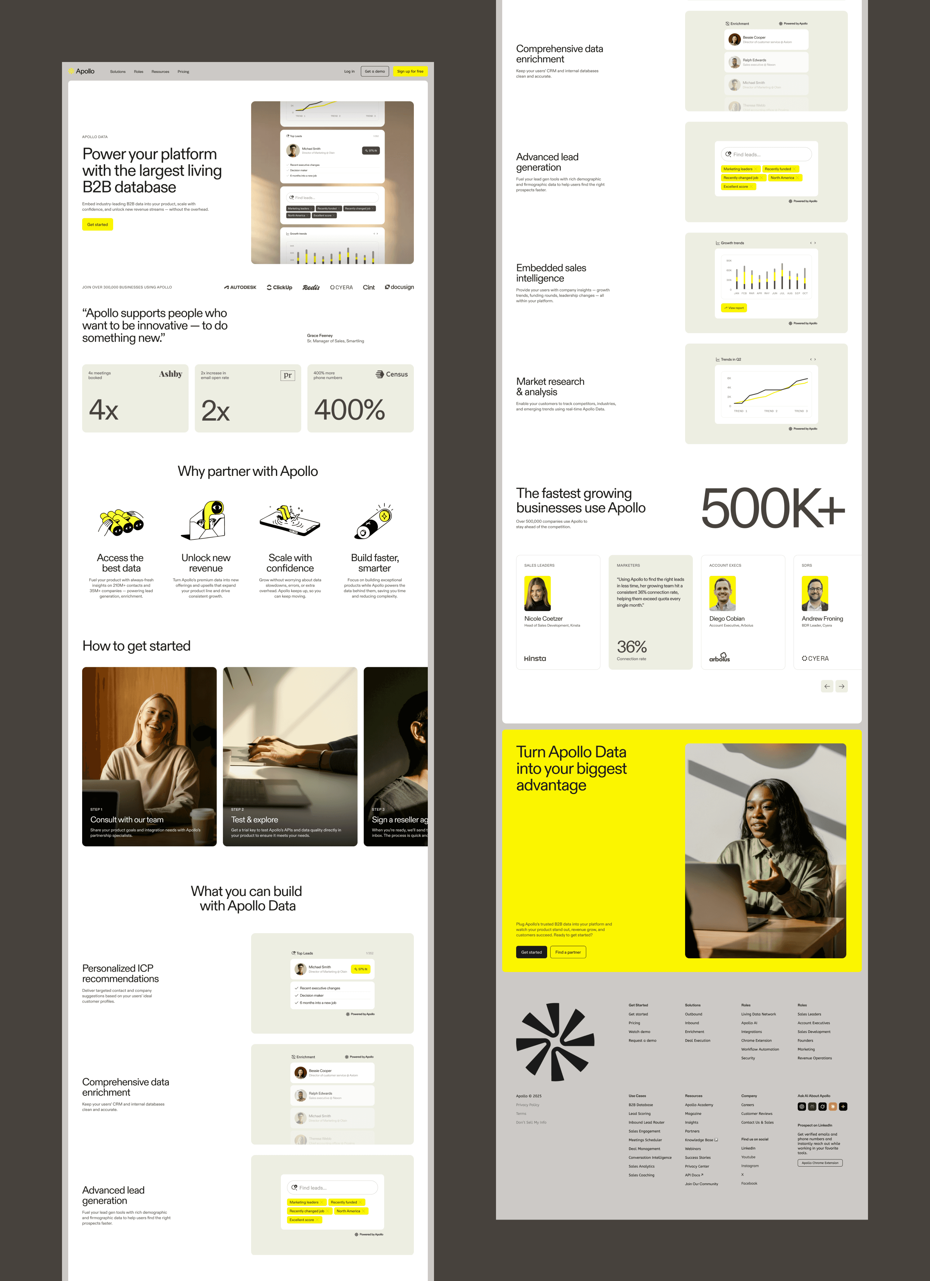
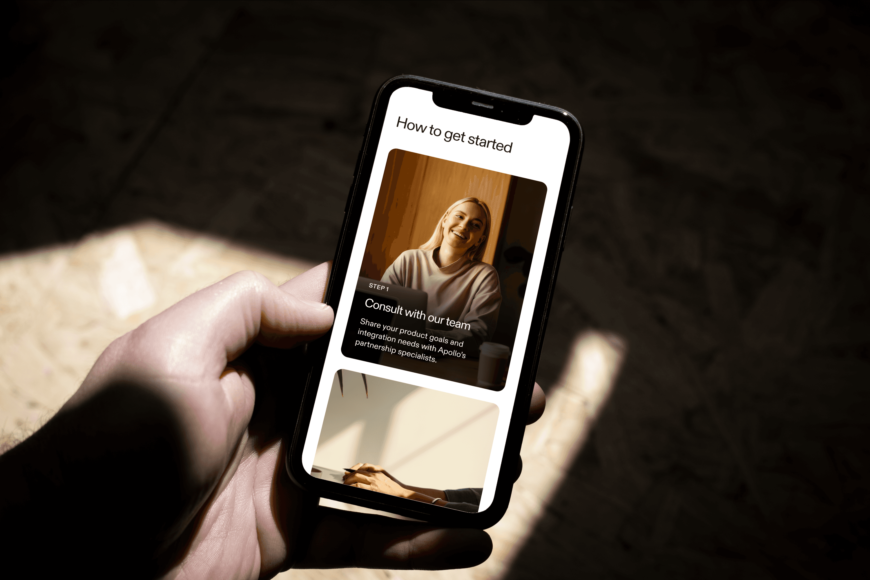
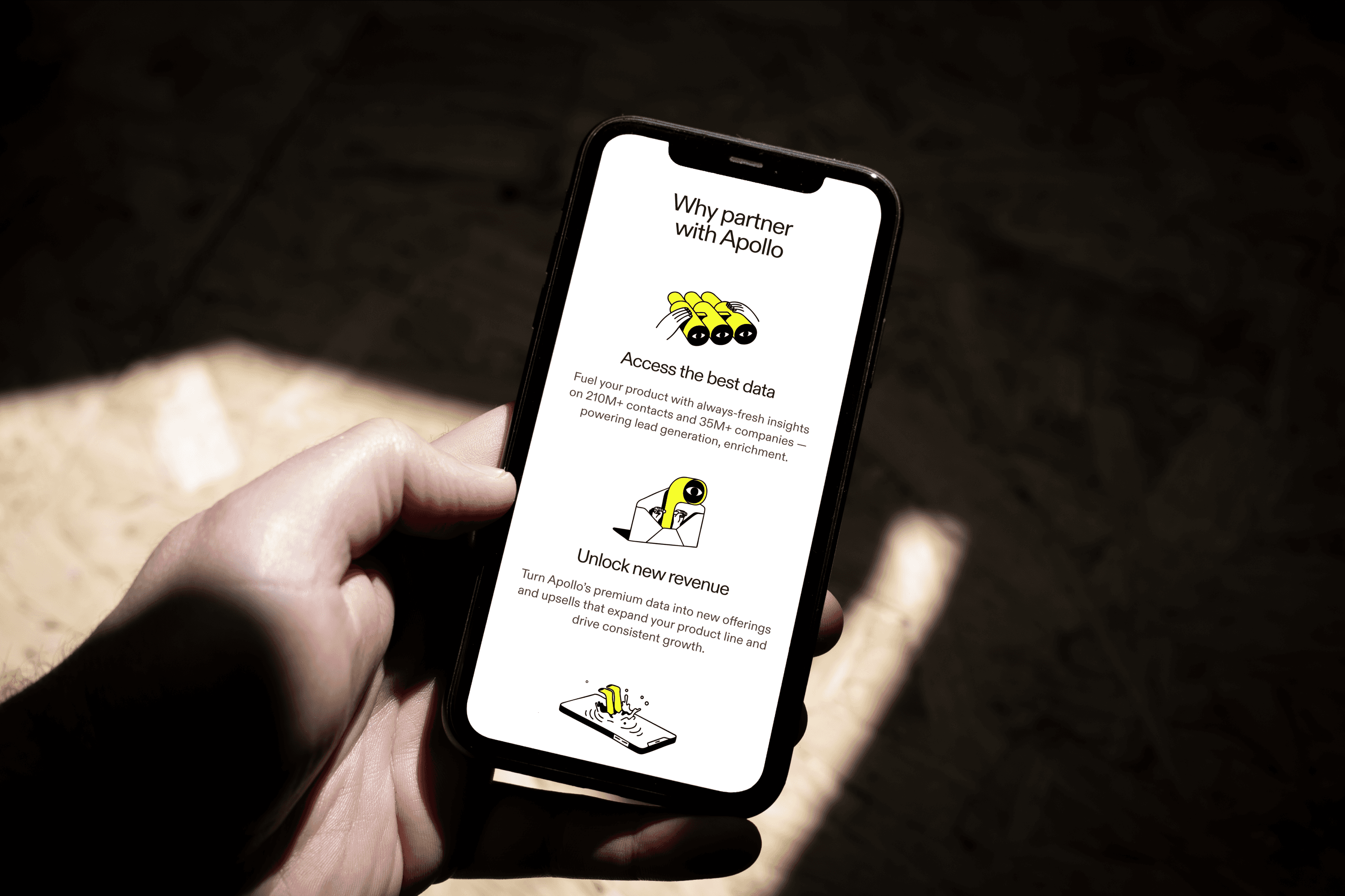
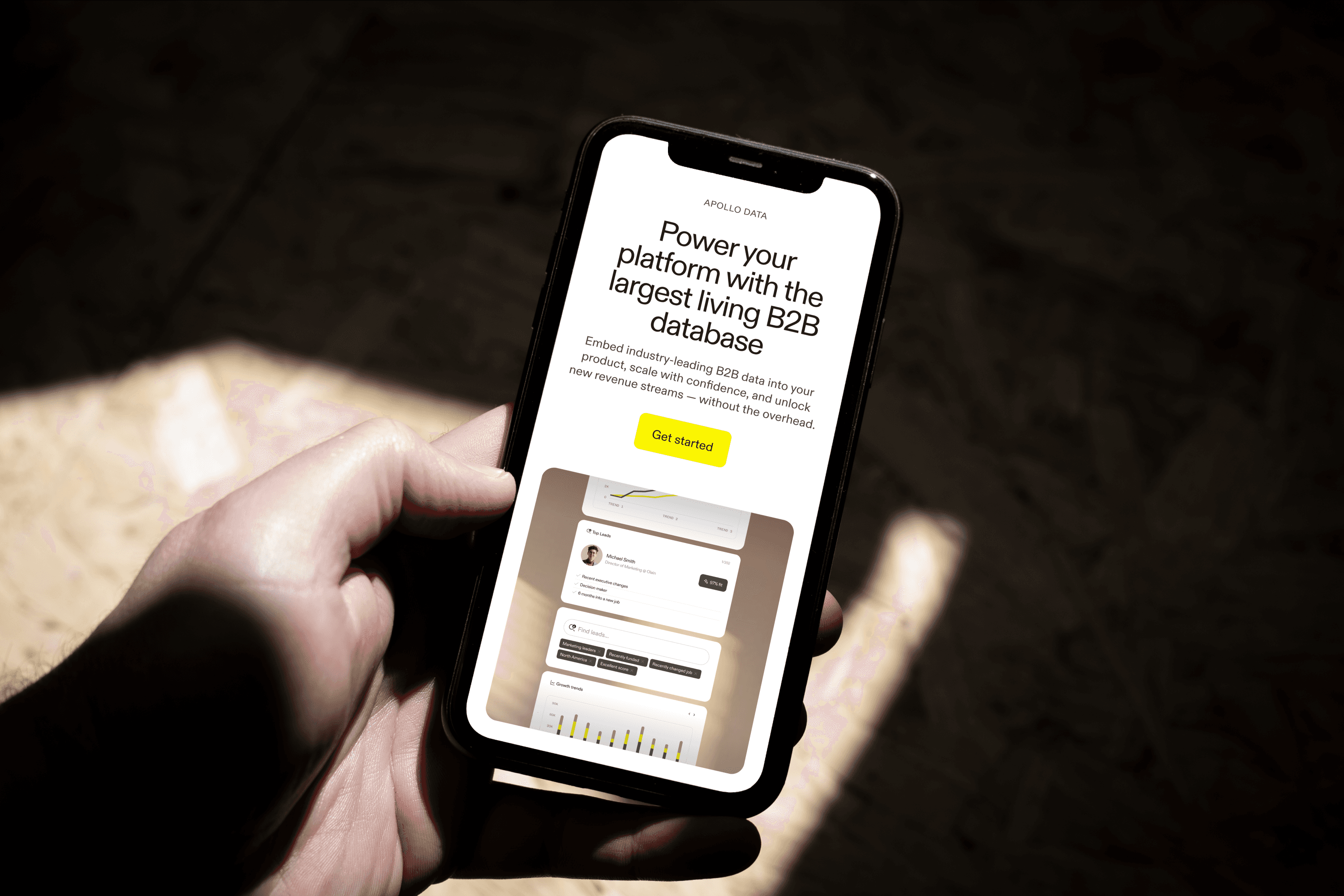
As Apollo's data offering expanded, the landing page wasn't keeping up. It was technically accurate but easy to get lost in, dense in a way that served no one, particularly visitors who weren't already fluent in the product category. Different audiences landed on the same page and left with different levels of confusion.
As Apollo's data offering expanded, the landing page wasn't keeping up. It was technically accurate but easy to get lost in, dense in a way that served no one, particularly visitors who weren't already fluent in the product category. Different audiences landed on the same page and left with different levels of confusion.
As Apollo's data offering expanded, the landing page wasn't keeping up. It was technically accurate but easy to get lost in, dense in a way that served no one, particularly visitors who weren't already fluent in the product category. Different audiences landed on the same page and left with different levels of confusion.


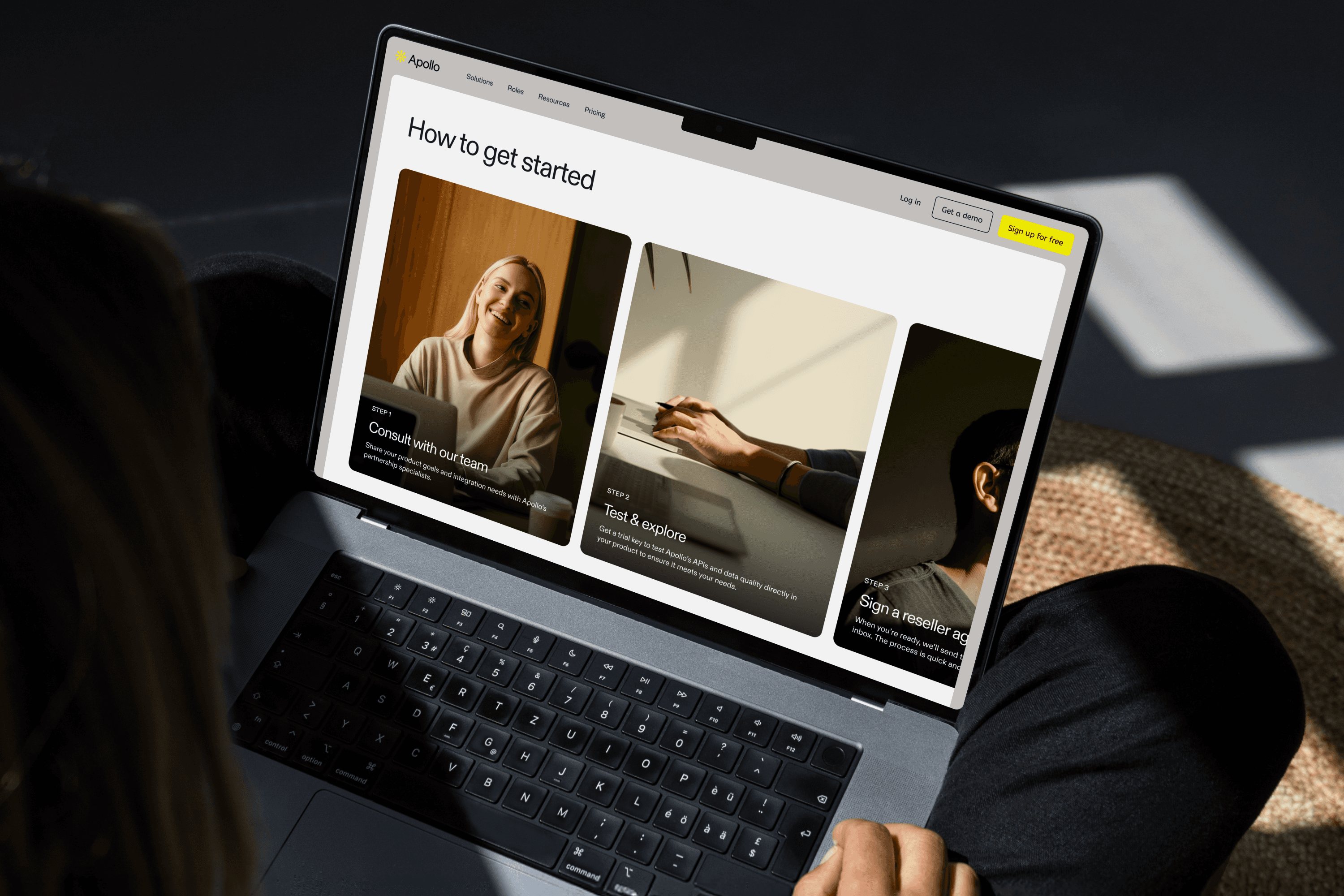
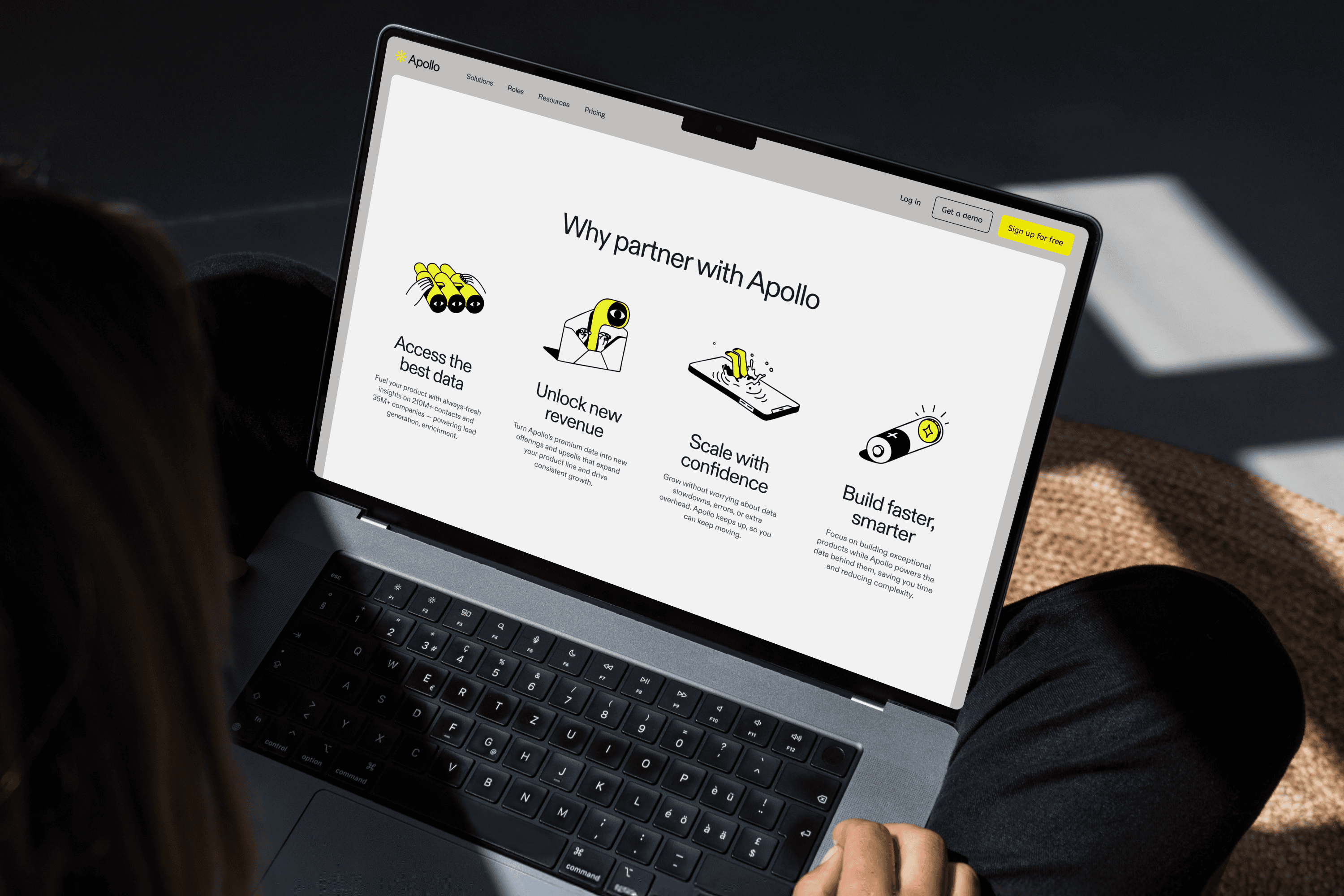

The instinct was to simplify. But stripping the page back risked alienating technical buyers who needed depth to trust the product. The real challenge was building a page that could meet multiple audience types where they were, without feeling like it was designed for no one in particular.
I redesigned the page in close collaboration with product and marketing, aligning messaging, visual hierarchy, and CTAs across audience types. Generated illustrations were integrated to reinforce visual consistency across the broader Apollo brand system, giving the page a coherent identity without one-off production for every section.
The instinct was to simplify. But stripping the page back risked alienating technical buyers who needed depth to trust the product. The real challenge was building a page that could meet multiple audience types where they were, without feeling like it was designed for no one in particular.
I redesigned the page in close collaboration with product and marketing, aligning messaging, visual hierarchy, and CTAs across audience types. Generated illustrations were integrated to reinforce visual consistency across the broader Apollo brand system, giving the page a coherent identity without one-off production for every section.
The instinct was to simplify. But stripping the page back risked alienating technical buyers who needed depth to trust the product. The real challenge was building a page that could meet multiple audience types where they were, without feeling like it was designed for no one in particular.
I redesigned the page in close collaboration with product and marketing, aligning messaging, visual hierarchy, and CTAs across audience types. Generated illustrations were integrated to reinforce visual consistency across the broader Apollo brand system, giving the page a coherent identity without one-off production for every section.
Product Storytelling
Product Storytelling
Product Storytelling
Making technical features feel like human benefits
Making technical features feel like human benefits
Making technical features feel like human benefits
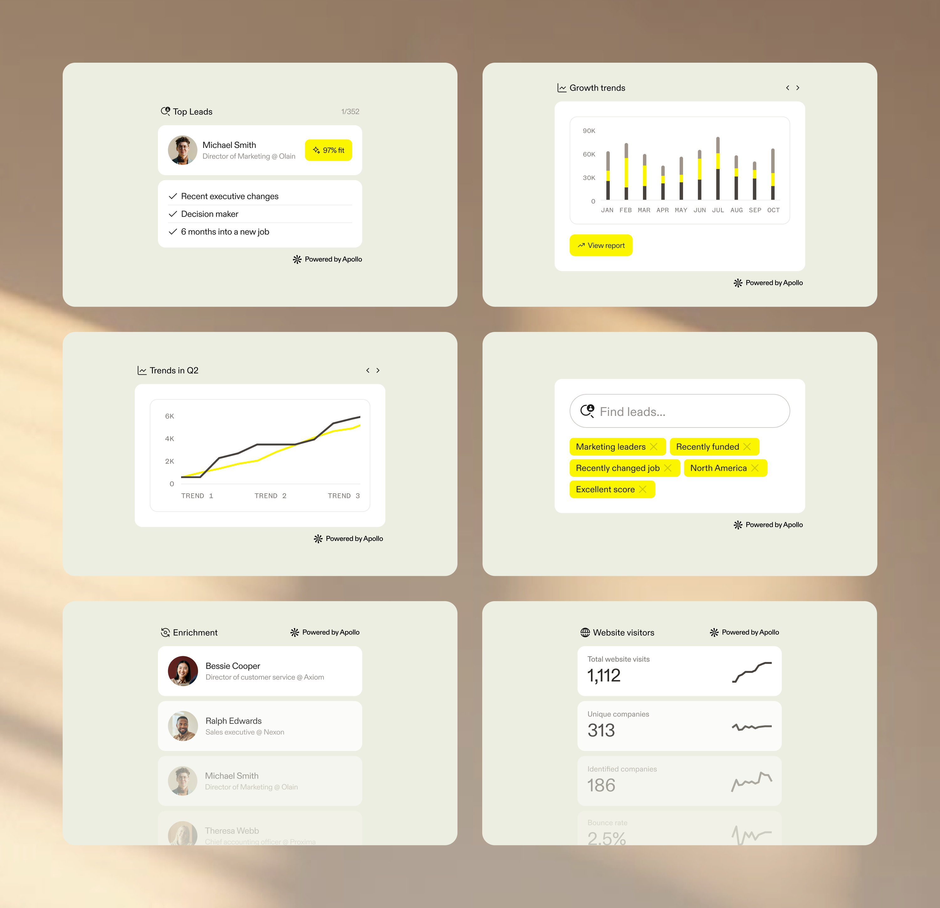
Apollo's data product had real technical sophistication, but the page was communicating features rather than outcomes. Visitors could read what the product did. They couldn't quickly understand why it mattered for them.
Working with product and marketing, I developed a storytelling system that translated technical concepts into more approachable narratives. This meant establishing consistent visual frameworks for feature communication, modular content patterns that paired capability with context, and structured layouts that let visitors scan for relevance before committing to depth. The system aligned tightly with the landing page experience so that storytelling and conversion worked together, not in parallel.
Apollo's data product had real technical sophistication, but the page was communicating features rather than outcomes. Visitors could read what the product did. They couldn't quickly understand why it mattered for them.
Working with product and marketing, I developed a storytelling system that translated technical concepts into more approachable narratives. This meant establishing consistent visual frameworks for feature communication, modular content patterns that paired capability with context, and structured layouts that let visitors scan for relevance before committing to depth. The system aligned tightly with the landing page experience so that storytelling and conversion worked together, not in parallel.
Apollo's data product had real technical sophistication, but the page was communicating features rather than outcomes. Visitors could read what the product did. They couldn't quickly understand why it mattered for them.
Working with product and marketing, I developed a storytelling system that translated technical concepts into more approachable narratives. This meant establishing consistent visual frameworks for feature communication, modular content patterns that paired capability with context, and structured layouts that let visitors scan for relevance before committing to depth. The system aligned tightly with the landing page experience so that storytelling and conversion worked together, not in parallel.
Collaborative Experimentation
Collaborative Experimentation
Collaborative Experimentation
Testing what intuition couldn't settle
Testing what intuition couldn't settle
Testing what intuition couldn't settle
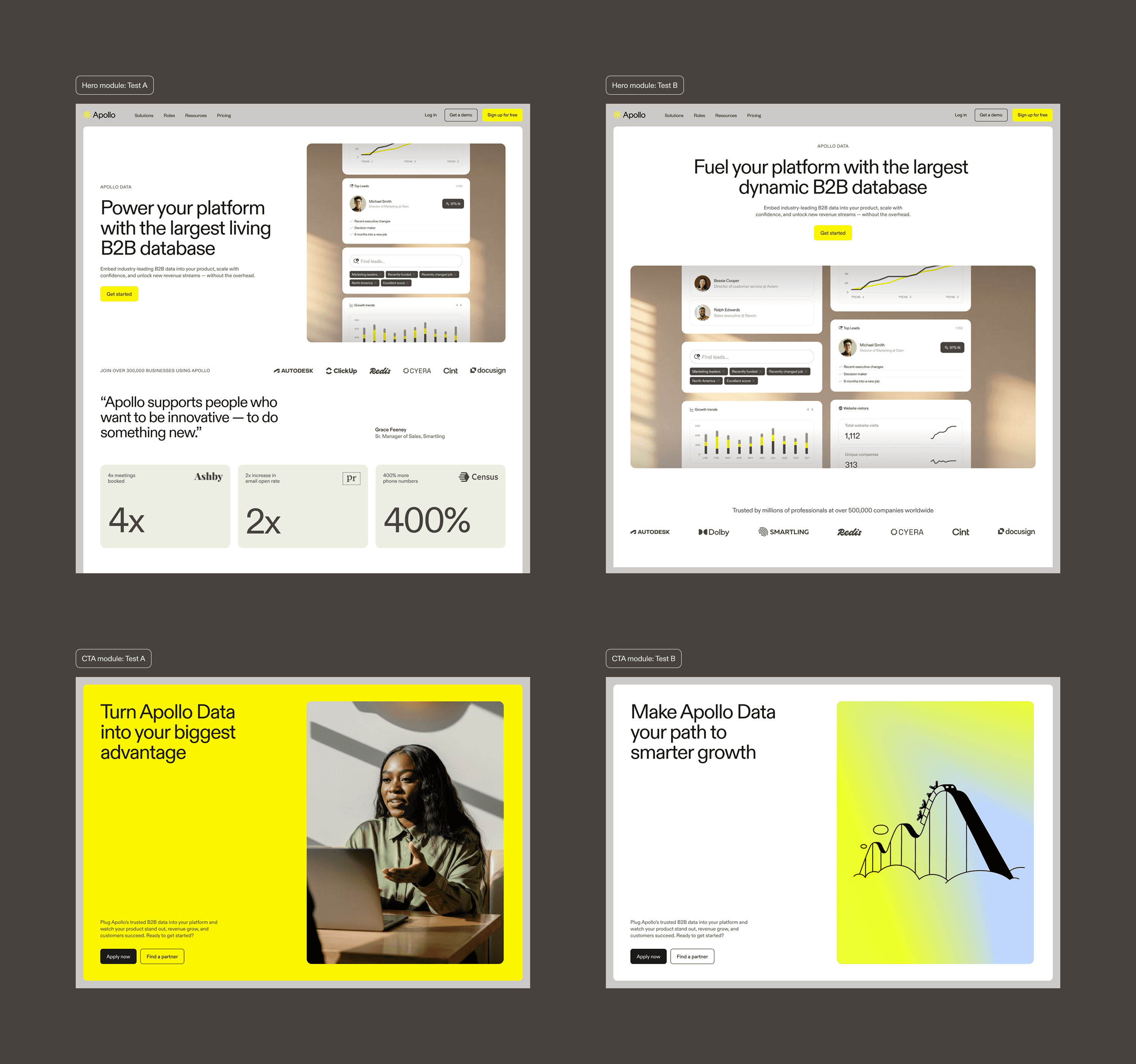
Design decisions on high-traffic pages carry real risk. Rather than shipping on conviction alone, I contributed to a structured A/B testing program across the page's most critical modules, hero sections and primary CTAs, testing content and visual variations against different audience segments to find what actually moved people.
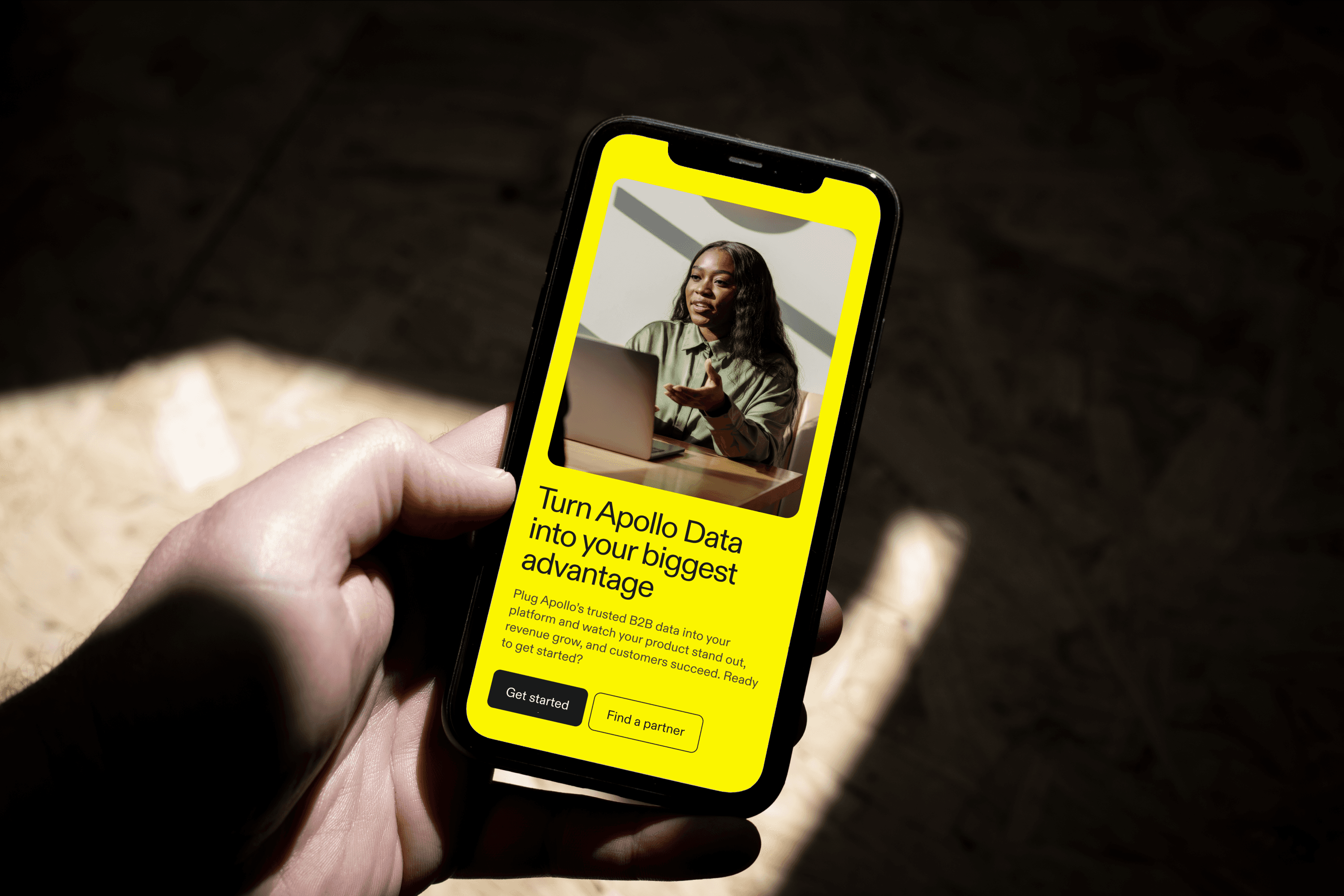
Two findings shaped the final direction in ways that surprised us. The strongest-performing hero variant wasn't the most visually refined. It was the one that surfaced value metrics and trust signals earliest, before users had scrolled or self-qualified. For the CTA module, photography on a solid branded yellow background significantly outperformed illustration-based treatments. Not because illustration was wrong for Apollo, but because the photographic approach created sharper contrast and registered faster in a scanning context.
That result became a reference point for subsequent brand art direction decisions, clarifying when to use each visual mode and why.
Design decisions on high-traffic pages carry real risk. Rather than shipping on conviction alone, I contributed to a structured A/B testing program across the page's most critical modules, hero sections and primary CTAs, testing content and visual variations against different audience segments to find what actually moved people.
Two findings shaped the final direction in ways that surprised us. The strongest-performing hero variant wasn't the most visually refined. It was the one that surfaced value metrics and trust signals earliest, before users had scrolled or self-qualified. For the CTA module, photography on a solid branded yellow background significantly outperformed illustration-based treatments. Not because illustration was wrong for Apollo, but because the photographic approach created sharper contrast and registered faster in a scanning context.
That result became a reference point for subsequent brand art direction decisions, clarifying when to use each visual mode and why.
Design decisions on high-traffic pages carry real risk. Rather than shipping on conviction alone, I contributed to a structured A/B testing program across the page's most critical modules, hero sections and primary CTAs, testing content and visual variations against different audience segments to find what actually moved people.
Two findings shaped the final direction in ways that surprised us. The strongest-performing hero variant wasn't the most visually refined. It was the one that surfaced value metrics and trust signals earliest, before users had scrolled or self-qualified. For the CTA module, photography on a solid branded yellow background significantly outperformed illustration-based treatments. Not because illustration was wrong for Apollo, but because the photographic approach created sharper contrast and registered faster in a scanning context.
That result became a reference point for subsequent brand art direction decisions, clarifying when to use each visual mode and why.
+16%
+16%
+16%
Click-throughs on primary CTAs post-redesign
Click-throughs on primary CTAs post-redesign
Click-throughs on primary CTAs post-redesign
+14%
+14%
+14%
Engagement with hero content across tested variants
Engagement with hero content across tested variants
Engagement with hero content across tested variants
Design Systems Expansion
Design Systems Expansion
Design Systems Expansion
Building for the next page, not just this one
Building for the next page, not just this one
Building for the next page, not just this one
One-off solutions had been the default. Each landing page was built largely from scratch, which meant inconsistency at the brand level and slow production cycles whenever campaigns needed to move fast.
One-off solutions had been the default. Each landing page was built largely from scratch, which meant inconsistency at the brand level and slow production cycles whenever campaigns needed to move fast.
One-off solutions had been the default. Each landing page was built largely from scratch, which meant inconsistency at the brand level and slow production cycles whenever campaigns needed to move fast.
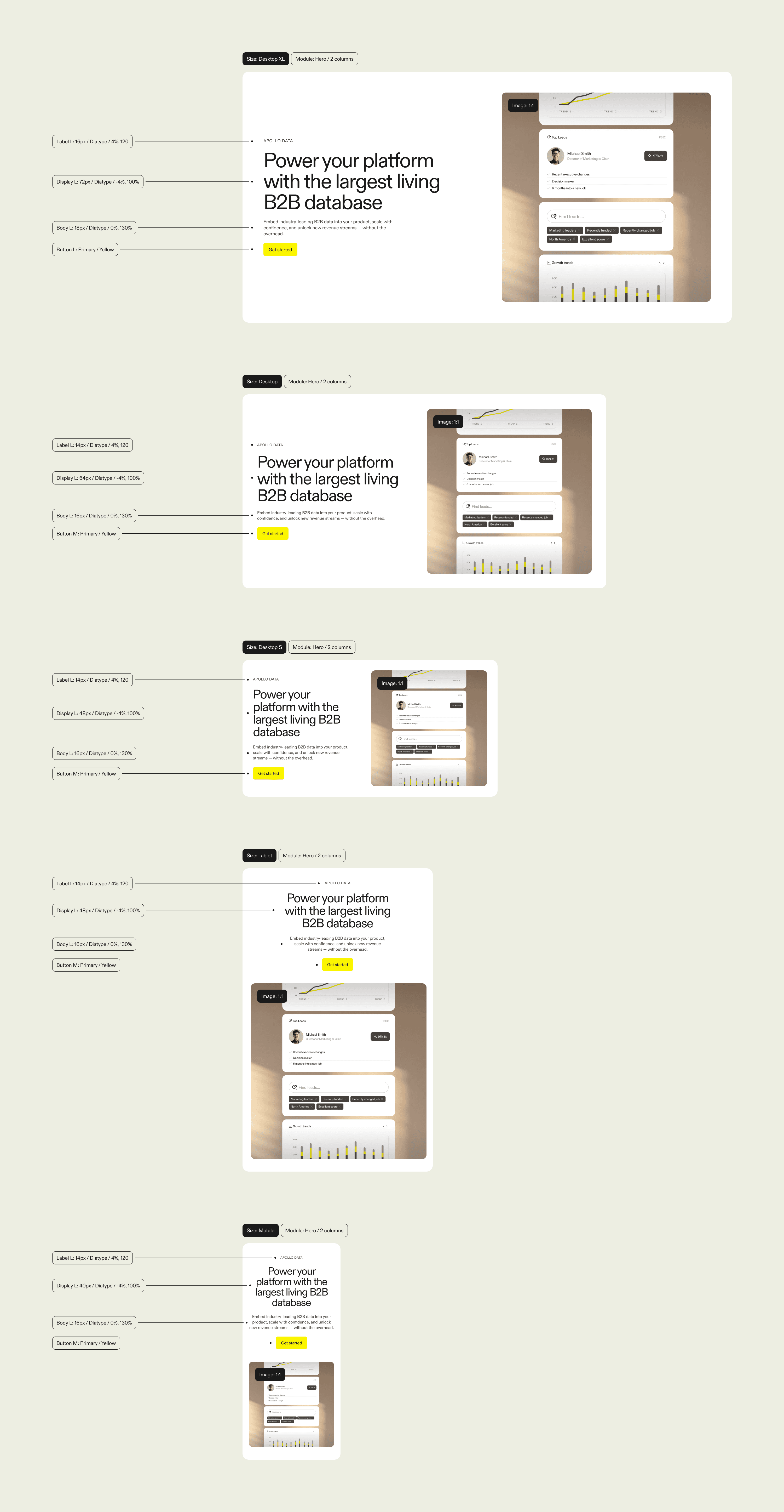
To fix that, I expanded the design system with reusable, modular components purpose-built for growth pages. Flexible patterns for structured content sections, value metric highlights, and CTA treatments that could adapt to different campaigns without breaking visual consistency. The result was a system that made the next landing page faster to build, more consistent in feel, and easier to experiment on, because the scaffolding was already there.
To fix that, I expanded the design system with reusable, modular components purpose-built for growth pages. Flexible patterns for structured content sections, value metric highlights, and CTA treatments that could adapt to different campaigns without breaking visual consistency. The result was a system that made the next landing page faster to build, more consistent in feel, and easier to experiment on, because the scaffolding was already there.
To fix that, I expanded the design system with reusable, modular components purpose-built for growth pages. Flexible patterns for structured content sections, value metric highlights, and CTA treatments that could adapt to different campaigns without breaking visual consistency. The result was a system that made the next landing page faster to build, more consistent in feel, and easier to experiment on, because the scaffolding was already there.


Marketing & Social
Marketing & Social
Marketing & Social
Extending the brand into motion and scale
Extending the brand into motion and scale
Extending the brand into motion and scale
Social was where Apollo's brand had the most room to breathe, and the most risk of fragmenting. With campaigns running across multiple formats and channels simultaneously, the challenge wasn't creativity. It was consistency. Assets needed to feel unmistakably Apollo whether they appeared as a LinkedIn carousel, an animated story, or a digital out-of-home placement.
B2B social is a crowded, low-attention environment. Looking polished isn't enough. The work had to stop the scroll while still feeling like it came from the same place as everything else Apollo put out.
Social was where Apollo's brand had the most room to breathe, and the most risk of fragmenting. With campaigns running across multiple formats and channels simultaneously, the challenge wasn't creativity. It was consistency. Assets needed to feel unmistakably Apollo whether they appeared as a LinkedIn carousel, an animated story, or a digital out-of-home placement.
B2B social is a crowded, low-attention environment. Looking polished isn't enough. The work had to stop the scroll while still feeling like it came from the same place as everything else Apollo put out.
Social was where Apollo's brand had the most room to breathe, and the most risk of fragmenting. With campaigns running across multiple formats and channels simultaneously, the challenge wasn't creativity. It was consistency. Assets needed to feel unmistakably Apollo whether they appeared as a LinkedIn carousel, an animated story, or a digital out-of-home placement.
B2B social is a crowded, low-attention environment. Looking polished isn't enough. The work had to stop the scroll while still feeling like it came from the same place as everything else Apollo put out.
I designed a system of animated assets built around Apollo's core brand language, typography, color, and motion principles, that could flex across formats without requiring a redesign for each one. Each asset was rooted in product truth, translating real platform capabilities into visuals that felt dynamic rather than corporate.
To keep pace with campaign volume, I partnered with engineering to implement automated social templates within the Cognition AI agent. This let the team run rapid messaging experiments and produce format variations without rebuilding from scratch each time, freeing up design bandwidth for higher-order creative decisions.
I designed a system of animated assets built around Apollo's core brand language, typography, color, and motion principles, that could flex across formats without requiring a redesign for each one. Each asset was rooted in product truth, translating real platform capabilities into visuals that felt dynamic rather than corporate.
To keep pace with campaign volume, I partnered with engineering to implement automated social templates within the Cognition AI agent. This let the team run rapid messaging experiments and produce format variations without rebuilding from scratch each time, freeing up design bandwidth for higher-order creative decisions.
I designed a system of animated assets built around Apollo's core brand language, typography, color, and motion principles, that could flex across formats without requiring a redesign for each one. Each asset was rooted in product truth, translating real platform capabilities into visuals that felt dynamic rather than corporate.
To keep pace with campaign volume, I partnered with engineering to implement automated social templates within the Cognition AI agent. This let the team run rapid messaging experiments and produce format variations without rebuilding from scratch each time, freeing up design bandwidth for higher-order creative decisions.
+22%
+22%
+22%
Social engagement rate across animated campaign assets
Social engagement rate across animated campaign assets
Social engagement rate across animated campaign assets
+17%
+17%
+17%
Click-through rate on social ads vs. prior static formats
Click-through rate on social ads vs. prior static formats
Click-through rate on social ads vs. prior static formats
What I'd do differently
What I'd do differently
What I'd do differently
Build the system earlier
Build the system earlier
Build the system earlier
The design system work unlocked real speed, but we built it reactively. Earlier investment would have cut the rework cycles we hit mid-project, particularly during the landing page and email sprints.
I'd also push harder for baseline metrics before experiments launched. Some results were directionally clear but harder to defend precisely because we hadn't anchored the starting point rigorously enough. That discipline matters, especially when making the case for brand decisions that don't have an obvious ROI line.
The design system work unlocked real speed, but we built it reactively. Earlier investment would have cut the rework cycles we hit mid-project, particularly during the landing page and email sprints.
I'd also push harder for baseline metrics before experiments launched. Some results were directionally clear but harder to defend precisely because we hadn't anchored the starting point rigorously enough. That discipline matters, especially when making the case for brand decisions that don't have an obvious ROI line.
The design system work unlocked real speed, but we built it reactively. Earlier investment would have cut the rework cycles we hit mid-project, particularly during the landing page and email sprints.
I'd also push harder for baseline metrics before experiments launched. Some results were directionally clear but harder to defend precisely because we hadn't anchored the starting point rigorously enough. That discipline matters, especially when making the case for brand decisions that don't have an obvious ROI line.
Interested in working together?
© Anton Aheichanka 2026
Interested in working together?
© Anton Aheichanka 2026
Interested in working together?
© Anton Aheichanka 2026